
Why Your Competitor Might Be Getting More Enquiries — Even With a Worse Website
The best-looking website doesn't always win. Sometimes the scruffier one down the road gets more calls simply because it makes the customer's decision easier.
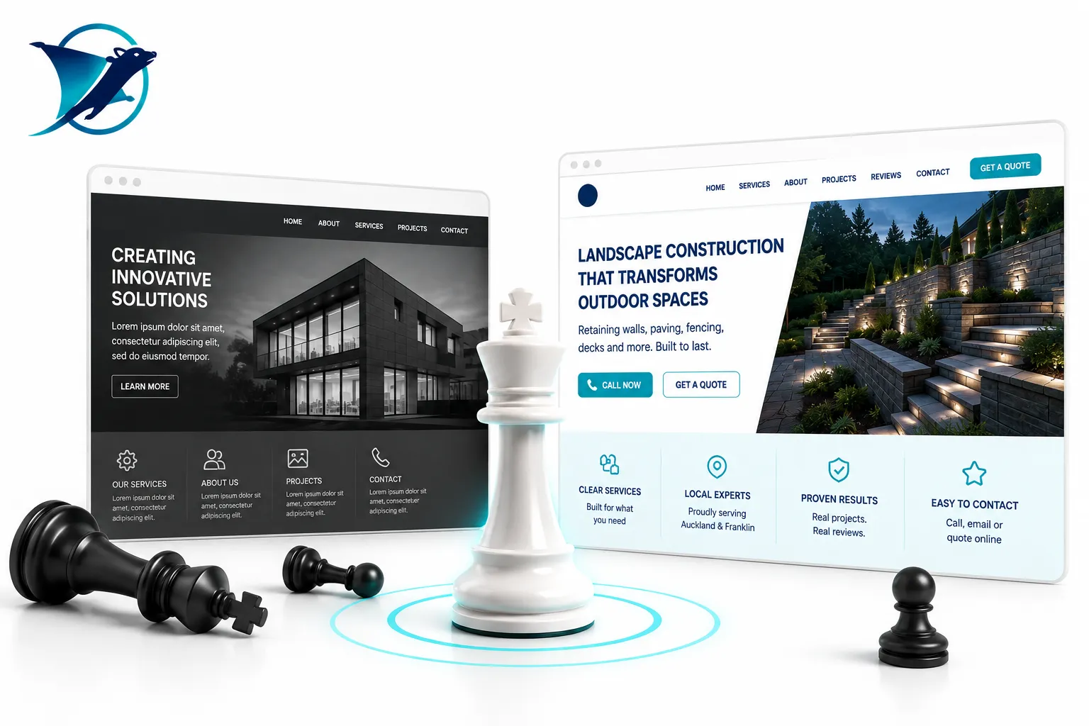
Your competitor doesn't necessarily need a better website. They just need to make it easier to choose them.
I've seen some beautiful websites that barely generate a phone call.
And I've seen some fairly ordinary-looking websites that work surprisingly well.
That's because customers aren't judging your website the same way another designer might.
They aren't sitting there admiring your typography.
They're trying to answer some fairly basic questions.
Can these people do what I need?
Do they work in my area?
Do they look trustworthy?
Have they done this before?
And how do I get hold of them?
If your competitor answers those questions faster than you do, they may get the enquiry — even if your website looks twice as flash.
Your competitor tells people what they do in five seconds.
Your website might have the better photography.
Better animation.
Better branding.
But if I land on it and spend twenty seconds trying to work out exactly what you sell, we've already got a problem.
It isn't as clever.
But I know exactly what the business does.
That's useful to customers, Google and increasingly AI systems as well.
Their customer doesn't have to hunt for the contact button.
It sounds ridiculously simple.
But plenty of websites make people work far too hard to actually become a customer.
Phone number hidden in the footer.
A contact form buried on another page.
No obvious quote button.
No indication what happens after somebody enquires.
Meanwhile your competitor has:
Don't make your customers solve a puzzle before they're allowed to give you money.
They don't just say they're good. They prove it.
Nearly every business says they're professional, reliable and experienced.
So does your competitor.
The difference is what happens next.
Do they show completed work?
Before-and-after photos?
Reviews?
Client names?
Case studies?
Videos of the actual people behind the company?
That stuff does far more work than another paragraph telling me how passionate the company is about customer service.
They remove uncertainty before the customer has to ask.
Customers hesitate when they don't know what happens next.
They wonder whether you service their area.
Whether the job is too small.
Whether you deal with commercial customers.
Whether they'll be waiting three months.
Whether they need to organise something before you arrive.
You don't have to publish every trade secret or put a fixed price against work that can't sensibly be quoted online.
Just answer enough to make the next step feel easy.
Their website looks like somebody still owns the business.
Here's a slightly awkward one.
If your latest project is from 2021 and the Christmas hours announcement is still sitting on your homepage, it doesn't inspire huge confidence.
Your competitor might simply be doing a better job of showing that things are happening.
You don't need to become a full-time blogger.
You just need enough fresh proof to show the lights are still on.
Their website doesn't punish mobile visitors.
Business owners often review their own websites sitting behind a desktop computer.
Customers aren't always doing that.
They're in the ute.
Standing on a job.
Sitting on the couch.
Trying to find somebody quickly on their phone.
If the text is tiny, buttons are awkward, pages are slow or a giant pop-up covers the whole screen, your beautiful desktop site isn't doing much for them.
A simpler competitor website that works really well on mobile can easily win.
Their website talks about the problem, not just themselves.
There's nothing wrong with telling people you've been around for 25 years.
Or that you've got great equipment.
Or that your team is qualified.
Those things matter.
But the customer is still thinking:
Your competitor may simply be better at connecting what they do with what the customer actually wants.
Less:
“We provide comprehensive landscape construction services.”
More:
“Turn that unusable sloping backyard into somewhere your family can actually enjoy.”
Same service.
Completely different conversation.
Better looking doesn't automatically mean better performing.
If I had to choose between these two websites, I know which one I'd back.
Looks fantastic.
Beautiful photos. Clever animation. Lots of brand language.
But the services are vague, the contact button is hard to find and there's very little proof.
Looks good enough — and makes sense.
Clear service. Clear location. Real projects. Reviews. Useful answers. Obvious next step.
That's the one I'd expect to generate more enquiries.
Pretty much the same place as your customer.
AI doesn't change the basic rules.
Clear services are easier to understand.
Useful answers provide better context.
Real projects, reviews and expertise provide stronger evidence about the business.
So the things that make your website more useful for a human often make it easier for search engines and AI systems to understand as well.
That's why I don't think businesses need to panic and suddenly turn their websites into some bizarre AI experiment.
Start by making the website better for people.
Your competitor doesn't need to be better than you. They just need to explain themselves better.
I've been designing long enough to know that great design matters.
Of course it does.
A professional business should look professional.
But design has a job to do.
It needs to help people understand the business, trust it and take the next step.
If your competitor's website does that better than yours, they may well be winning enquiries you should have had.
And that's something worth fixing.
Not because AI says so. Because good marketing says so.
Think a competitor is getting more enquiries than you?
Send me your website and one competitor's website. I'll take a quick look at both and tell you where I think they're beating you, where you're beating them, and what I'd change first.
No enormous report. No automatic website rebuild pitch. Just a useful comparison from someone who's been doing this for a long time.
Ask Jason to Compare Our Websites